Coming up with a cover for The Killdeer Connection was no easy task.
I thought it might be interesting for readers and writers to see the process at work before I officially reveal my cover for the upcoming novel.
What I’ll do in this series of articles is to analyze some book covers and tell you what I liked about them and why I ultimately rejected them.
In the first part of this series, you can see how I wrestled with having a killdeer on the cover. Click this link here to read that article. In the second article, I toyed with the idea of having an oil pumpjack on the cover as opposed to a bird. Click this link here to read that article.
As stated in my first article, the overall goal for any book cover is to sell books. Along the way, I came up with two criteria to meet that goal:
(1) It has to mix in with other covers in the genre but it has to stand out at the same time.
(2) The cover has to convey the real story in a compelling way that connects with the reader.
So with that in mind, let’s look at my next attempt to create a cover.
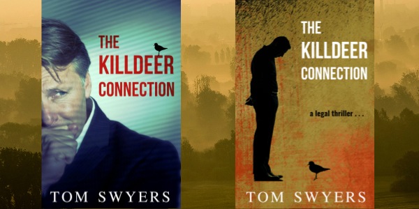
Since the winner of my book cover contest in my second article was a killdeer with a swampy, green background, I wanted to keep the bird but try something new. I thought the cover was lacking the human element. The Killdeer Connection is more than a story about a type of bird. It’s about one man’s relationship with that type of bird.
There was an article about what images worked for Netflix advertisements a few years back. I attempted to apply the same winning philosophy that worked for Netflix to my book cover. You can read the Netflix article by clicking the link here. The article concluded:
Netflix discovered is that people tend to focus more on images of people displaying complicated expressions over stoic or benign ones. These highly emotive images are able to quickly and effectively convey subtle details about the show or movie, drawing users into the storyline and prompting them to watch it.
So the first cover I developed for this competition was a man with a very concerned look on his face. His emotion was intended to convey that the book was a thriller of sorts. I kept the bird in that cover but it became secondary. The other cover I developed has a silhouette of a man looking down on a bird with a very eerie backdrop. I felt that I had to convey that the book was a legal thriller with this cover and so I included that with some text.
It turns out that the Netfilx results don’t appear to apply to book readers. You can see the results of a blind poll below where the man’s face on the cover lost by a wide margin: 72% to 28%. Read the comments below. People thought the silhouette cover was more mysterious. They thought that cover left it up to their imagination which they found more appealing. They didn’t like the look on the man’s face.
I think the results are worth considering if you are an author debating on whether or not to clearly show someone’s face on the cover. If you are going to use a face, you better make sure it’s the right face.
Even though the silhouette cover won this round, I still thought something was missing from it. It looked more a work of literary fiction rather than a legal thriller. The comments in the poll brought that to light. So in part four of this series, I’ll show how I tried to move in the direction of creating a book cover that a reader would readily recognize as a legal thriller.
Tom Swyers is an attorney, judge, and the award-winning author of Saving Babe Ruth, the prequel to the David Thomson Lawyer Series. His upcoming legal thriller, The Killdeer Connection, is the first book in the David Thompson Lawyer Series. It’s about a lawyer who must battle the fracking industry before it kills him and his family. Sign up to join the readers group to keep up to date by clicking this link here .

very nice book